
Mayor's Grocery Store
A Historic Site,
Redefined for the Future of Atlanta.
Design Role
UX Researcher
Contribution
UX Research
UI Design
Duration
Fall 2024
10 Weeks
Tools
Figma
Slack
Looking For More?


The Problem
What Happens When a City Lacks Access to Fresh, Affordable Food?
In downtown Atlanta, many residents live in food deserts—areas where access to nutritious, affordable groceries is severely limited. This lack creates daily barriers, forcing people to travel long distances or settle for unhealthy alternatives.
Our Challenge:
Transform a symbolic site into a modern, human-centered shopping experience that restores dignity, fosters connection, and supports everyday needs.
Key Takeaways:
What stood out most was how foundational our research became to the entire project. The work we did early on, like interviewing locals, observing behavior, and mapping user needs, shaped everything that followed. It was rewarding to see those insights reflected in branding decisions, interior layouts, and even in conversations with stakeholders. This experience showed me that strong research brings clarity, direction, and alignment across every part of a design process.
What I Learned:
This experience taught me how foundational strong user research really is. The work we did early on — talking to the community, digging into pain points, and capturing real needs ended up guiding every team, from branding to interiors. It gave everyone a shared direction. I learned that when you take the time to truly understand people, it makes every creative choice that follows more intentional, more grounded, and more impactful.


The Presentation
How Do You Share a Vision That’s Rooted in Research?
To bring our work to life, we invited key stakeholders including Mayor Dickens and Paul, the founder of Savi Provisions, to review our progress. The session opened with research posters from the UX and ID teams, highlighting core insights and user-driven opportunities. This was followed by presentations from the Branding and Advertising and Interior Design teams, each showcasing their creative direction for the grocery experience.
Check out my next featured projects...

Google feather
Reimagining the Google Nest and app as Google Feather, blending eco-conscious functionality with mindful design.
Interaction Design
Design Systems
UI Design
Looking For More?
To design a store that truly serves its community, we had to understand it first.
We grounded our process in human-centered research, getting close to the people and context that shape downtown Atlanta. Our goal: uncover habits, frustrations, and values that often go unseen.
Understanding What the Community Really Needs:
From Insights to People
The research helped us move beyond assumptions and design for real people. We distilled our findings into key personas that reflect the diverse needs, behaviors, and values of downtown Atlanta’s residents.
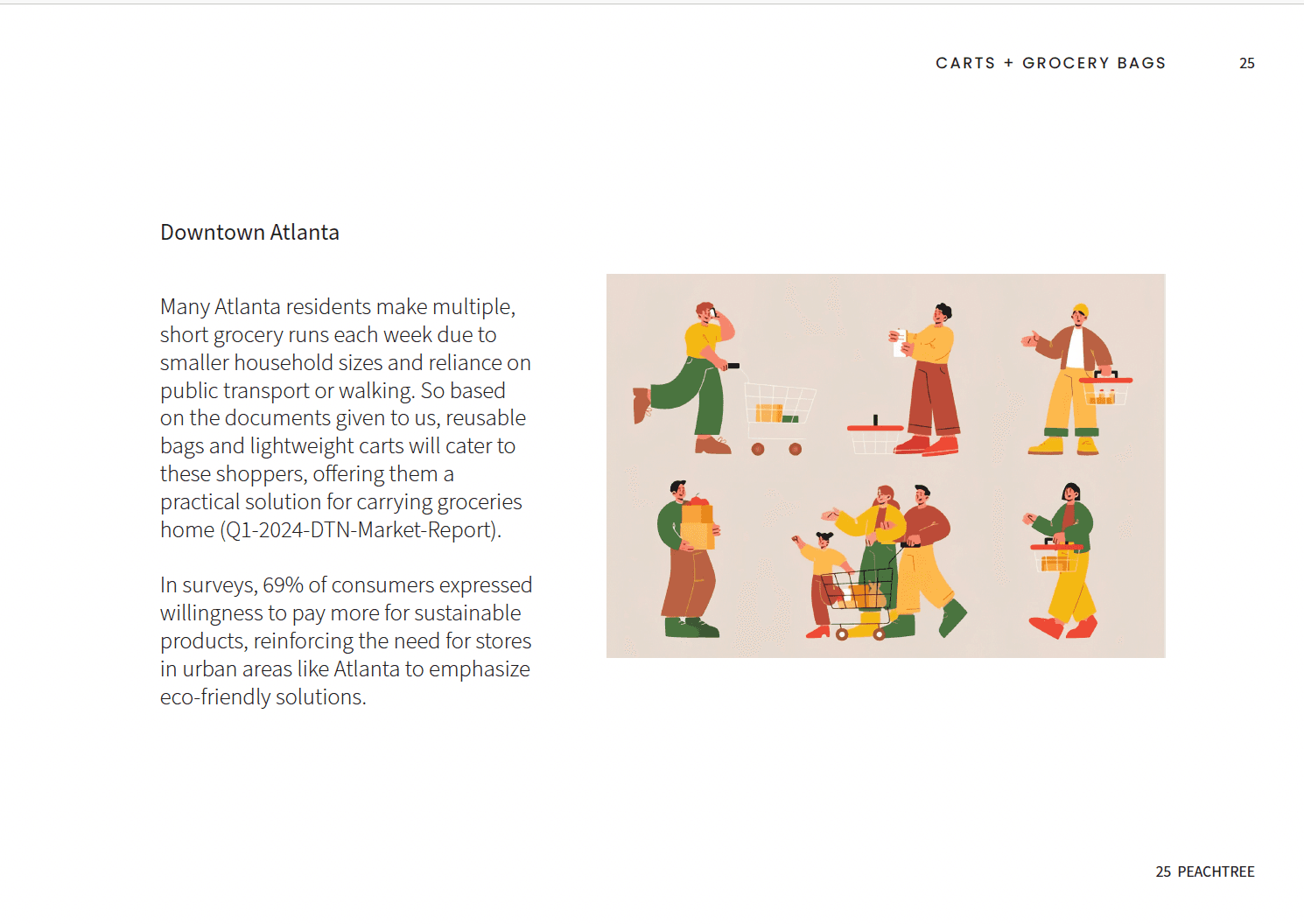
Street interviews informed the creation of personas that represent downtown Atlanta’s diverse population. For example, 'Natasha' reflects a busy commuter seeking convenience and affordability, while 'Ken' highlights local residents valuing community connection and sustainability. These guided our user-focused design decisions.
Reserach
What Happens When a City Lacks Access to Fresh, Affordable Food?
In downtown Atlanta, many residents live in food deserts—areas where access to nutritious, affordable groceries is severely limited. This lack creates daily barriers, forcing people to travel long distances or settle for unhealthy alternatives.
Our Challenge:
Transform a symbolic site into a modern, human-centered shopping experience that restores dignity, fosters connection, and supports everyday needs.
We conducted:
With these insights in hand, we moved from understanding to envisioning — translating research into tangible concepts for a modern grocery experience.
Explores the integration of physical and digital interactions, including app and kiosk concepts, to enhance the customer experience and streamline shopping.
Phygital Touchpoints: Enhancing User Experience
Mapped how staff and shoppers interact to streamline operations and improve user satisfaction.
Studied how lighting, layout, and materials affect shopper behavior and emotional comfort.
Defined a cohesive visual identity through color, material, and finish choices that reflect each brand’s tone.
Focused on creating accessible and inviting entry points that connect the store to the neighborhood context.
Research Packets: Understanding The Experience
Our team created five specialized research packets, each examining a different layer of the grocery store experience. These insights shaped how we approached digital, spatial, and brand design across both concepts.
Comprehensive Research Approach
Alongside Phygital Touchpoints, we developed four additional research packets, each essential to building a well-rounded and responsive store.

A modern and bold identity focusing on freshness and trustworthiness.
A community-centered concept symbolizing resilience and connection.

These visual identities helped set the tone for environments, signage, and marketing—ensuring that every brand touchpoint resonated with the people it was designed to serve.
The Identity
What Should a Community Grocery Store Feel Like?
IInformed by our research, we explored how branding could capture not just what the store offers—but what it stands for. From warmth and trust to resilience and pride, our team developed two distinct directions that reflect the values and aspirations of downtown Atlanta’s residents.
The app’s key features were thoughtfully designed to reflect the needs of all four personas. The Quick Payment & Barcode screen supports Natasha’s need for speed, while the Order Pickup screen aligns with Ken’s emphasis on sustainability. Recipe and Cooking Class screens tap into Corey’s curiosity, and the Digital Wallet and Loyalty features cater to Burt’s grab-and-go lifestyle. Together, these touchpoints transform insights into intuitive, persona-driven interactions.


The Digital Touchpoint
How Can an App Make Grocery Shopping Feel Local, Fast, and Thoughtful?
Building on the physical experience, we translated our research into a digital interface that reflects the store’s core values. The app design centers on convenience, community, and sustainability—pillars that emerged through branding development and user research.
Guided by insights from the Phygital Packet, we prioritized features that streamline shopping while meeting the distinct needs of our personas.