Rethinking how small businesses apply for funding
A mobile-first loan application that checks eligibility early and shows qualified applicants a preliminary funding amount before bank verification.
Overview
New requirements had outgrown IOU’s loan application. Its flow and interface needed a complete rethink.
Following the merger of Zing Funding and IOU, the website had a new visual identity, but the loan application still reflected the Zing experience. The existing application flow ended with a promised advisor callback, without showing small businesses applying for a loan a potential funding amount. New business requirements called for a complete rethink, and tracking showed more applicants used phones than desktops, making mobile the priority. As the sole product designer, I defined the application’s information architecture, screen layouts, and mobile interactions. I structured the flow to introduce sensitive requests at the right moments and guide applicants through verification and submission. Research and interactive prototypes informed those decisions, while IOU’s new visual language provided the foundation for the interface.
Rethinking how small businesses apply for funding
A mobile-first loan application that checks eligibility early and shows qualified applicants a preliminary funding amount before bank verification.
Overview
New requirements had outgrown IOU’s loan application. Its flow and interface needed a complete rethink.
Following the merger of Zing Funding and IOU, the website had a new visual identity, but the loan application still reflected the Zing experience. The existing application flow ended with a promised advisor callback, without showing small businesses applying for a loan a potential funding amount. New business requirements called for a complete rethink, and tracking showed more applicants used phones than desktops, making mobile the priority. As the sole product designer, I defined the application’s information architecture, screen layouts, and mobile interactions. I structured the flow to introduce sensitive requests at the right moments and guide applicants through verification and submission. Research and interactive prototypes informed those decisions, while IOU’s new visual language provided the foundation for the interface.
BEFORE · ZING FundinG

AFTER · IOU FInancial


You’re Ready to Submit!
Your application is complete and ready for final review.
PRE-QUALIFICATION AMOUNT
$100,000
Estimated based on your business revenue.
Final offer may vary after bank verification
Business Name:
ABC Company LLC
Loan Purpose:
Equipment Purchase
Identity verified
Credit check completed
Bank account connected
I certify that the information provided in this application is true and accurate, and I consent to electronically sign and submit this application.
I agree to receive marketing communications, product updates, and special offers from IOU Financial.
You can unsubscribe anytime
Previous
Submit Application
Your information is protected with bank-level encryption
Final Step
100%

BEFORE · ZING FundinG
Callback promised, no funding amount shown.
AFTER · IOU FInancial
Preliminary funding amount shown before submission.


You’re Ready to Submit!
Your application is complete and ready for final review.
PRE-QUALIFICATION AMOUNT
$100,000
Estimated based on your business revenue.
Final offer may vary after bank verification
Business Name:
ABC Company LLC
Loan Purpose:
Equipment Purchase
Identity verified
Credit check completed
Bank account connected
I certify that the information provided in this application is true and accurate, and I consent to electronically sign and submit this application.
I agree to receive marketing communications, product updates, and special offers from IOU Financial.
You can unsubscribe anytime
Previous
Submit Application
Your information is protected with bank-level encryption
Final Step
100%
BEFORE · ZING FundinG
Callback promised, no funding amount shown.
AFTER · IOU FInancial
Preliminary funding amount shown before submission.



You’re Ready to Submit!
Your application is complete and ready for final review.
PRE-QUALIFICATION AMOUNT
$100,000
Estimated based on your business revenue.
Final offer may vary after bank verification
Business Name:
ABC Company LLC
Loan Purpose:
Equipment Purchase
Identity verified
Credit check completed
Bank account connected
I certify that the information provided in this application is true and accurate, and I consent to electronically sign and submit this application.
I agree to receive marketing communications, product updates, and special offers from IOU Financial.
You can unsubscribe anytime
Previous
Submit Application
Your information is protected with bank-level encryption
Final Step
100%

BEFORE · ZING FundinG
Callback promised, no funding amount shown.
AFTER · IOU FInancial
Preliminary funding amount shown before submission.


You’re Ready to Submit!
Your application is complete and ready for final review.
PRE-QUALIFICATION AMOUNT
$100,000
Estimated based on your business revenue.
Final offer may vary after bank verification
Business Name:
ABC Company LLC
Loan Purpose:
Equipment Purchase
Identity verified
Credit check completed
Bank account connected
I certify that the information provided in this application is true and accurate, and I consent to electronically sign and submit this application.
I agree to receive marketing communications, product updates, and special offers from IOU Financial.
You can unsubscribe anytime
Previous
Submit Application
Your information is protected with bank-level encryption
Final Step
100%
What Shipped
A mobile application that guides small businesses from eligibility to submission, with preliminary funding shown along the way.
The application launched in March 2026. Applicants check eligibility, provide business and personal details, create an account, and verify their email. After identity verification and a credit check, eligible applicants see a preliminary funding amount. They then connect their bank or upload statements before reviewing and submitting their application. The confirmation explains that bank data is being analyzed and a final offer will follow by email. Business-lookup failures, verification errors, and decline states were also designed so the experience accounted for more than a successful walkthrough
Flow Decisions
The flow checks eligibility early and gives applicants context before requesting sensitive information and bank access.
The business needed earlier eligibility screening, better application data, and a bank-connection option. Account creation and email verification added more work for applicants. The requirements needed to be organize to design a manageable flow. Using competitive examples and secondary research, I compared delaying demanding requests, introducing them early, and staging them throughout the application. With early eligibility screening established as a requirement, I focused on sequencing the remaining steps. Applicants who did not meet the initial criteria could exit before providing a Social Security Number (SSN).


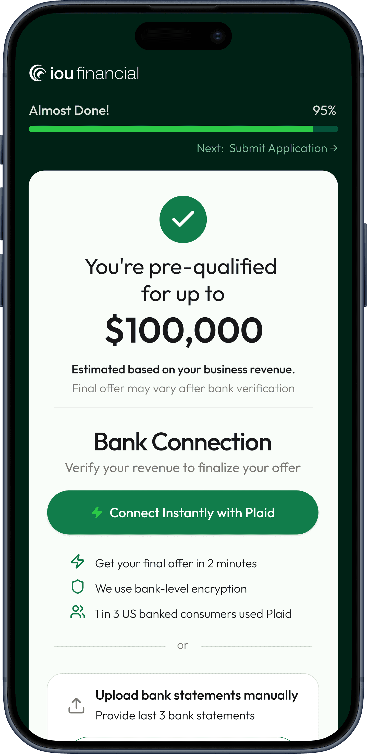
The explanation beside the Social Security number (SSN) field lets applicants know the credit inquiry will not affect their score, with consent copy reviewed through compliance. Before connecting their bank, eligible applicants can see how much funding they may qualify for and decide whether to continue. A note clarifies that the amount may change after verification, setting expectations before they share financial information.

Mobile Design & Exploration
A mobile-first application with larger selection targets and clear phases to make a longer flow feel manageable.
Device tracking showed that more applicants used phones than desktops, making mobile the starting point for the layouts and interactions. Key selections used bottom sheets, panels that slide up from the bottom of the screen. These gave options more room and larger areas to tap than compact dropdown menus. Named phases and previews of the next step helped applicants understand where they were and what came next. Research into endowed progress informed the chunked percentages, with the intent of creating a sense of advancement early. Those percentages represented stages rather than time remaining. I explored layouts and interactions through code mockups with Claude, then used it to write Figma Make prompts. Refining those generated screens in Figma reduced the manual work of recreating layouts and left more time for interaction details. Without access to small business applicants before launch, I used synthetic scenario reviews in Gemini to explore possible friction. These flagged finding an Employer Identification Number (EIN), switching apps for email verification, and seeing completion signals too early. The findings were hypotheses for follow-up, not evidence that real applicants would complete the flow. After launch, I used Lookbook to define reusable fields, buttons, and interaction states for engineering. These gave developers consistent references for implementation and helped address visual inconsistencies across the application.
What Shipped
A mobile application that guides small businesses from eligibility to submission, with preliminary funding shown along the way.
The application launched in March 2026. Applicants check eligibility, provide business and personal details, create an account, and verify their email. After identity verification and a credit check, eligible applicants see a preliminary funding amount. They then connect their bank or upload statements before reviewing and submitting their application. The confirmation explains that bank data is being analyzed and a final offer will follow by email. Business-lookup failures, verification errors, and decline states were also designed so the experience accounted for more than a successful walkthrough
Flow Decisions
The flow checks eligibility early and gives applicants context before requesting sensitive information and bank access.
The business needed earlier eligibility screening, better application data, and a bank-connection option. Account creation and email verification added more work for applicants. The requirements needed to be organize to design a manageable flow. Using competitive examples and secondary research, I compared delaying demanding requests, introducing them early, and staging them throughout the application. With early eligibility screening established as a requirement, I focused on sequencing the remaining steps. Applicants who did not meet the initial criteria could exit before providing a Social Security Number (SSN).
The explanation beside the Social Security number (SSN) field lets applicants know the credit inquiry will not affect their score, with consent copy reviewed through compliance. Before connecting their bank, eligible applicants can see how much funding they may qualify for and decide whether to continue. A note clarifies that the amount may change after verification, setting expectations before they share financial information.
Mobile Design & Exploration
A mobile-first application with larger selection targets and clear phases to make a longer flow feel manageable.
Device tracking showed that more applicants used phones than desktops, making mobile the starting point for the layouts and interactions. Key selections used bottom sheets, panels that slide up from the bottom of the screen. These gave options more room and larger areas to tap than compact dropdown menus. Named phases and previews of the next step helped applicants understand where they were and what came next. Research into endowed progress informed the chunked percentages, with the intent of creating a sense of advancement early. Those percentages represented stages rather than time remaining. I explored layouts and interactions through code mockups with Claude, then used it to write Figma Make prompts. Refining those generated screens in Figma reduced the manual work of recreating layouts and left more time for interaction details. Without access to small business applicants before launch, I used synthetic scenario reviews in Gemini to explore possible friction. These flagged finding an Employer Identification Number (EIN), switching apps for email verification, and seeing completion signals too early. The findings were hypotheses for follow-up, not evidence that real applicants would complete the flow. After launch, I used Lookbook to define reusable fields, buttons, and interaction states for engineering. These gave developers consistent references for implementation and helped address visual inconsistencies across the application.
COLOR
Emerald
emerald/700
#002115
emerald/600
#00543b
emerald/500
#117d4b
emerald/300
#88c59a
emerald/200
#cee7d5
emerald/100
#e9f3ea
emerald/50
#f9fdf9
Neutral
neutral/1000
#151413
neutral/800
#3f3d3a
neutral/700
#7d7a74
neutral/500
#d1ccc2
neutral/300
#e3e0da
neutral/100
#f6f5f3
neutral/000
#ffffff
Accent & feedback
green/500
#2bc947
feedback/error
#c82659
feedback/warning
#f45703
feedback/info
#124bd5
TYPOGRAPHY — OUTFIT
Title
32 / Medium / 36 line-height · emerald/700
Get started with your application
Subtext
17 / Regular / 24 line-height · neutral/1000
A few quick questions to see how much you qualify for.
SNIPPET OF COMPONENTS
Input fields — mobile
Default
Label
Enter your details
Focus
Label
Text Input
Error
Label
Text Input
Please enter a valid value
Password
Label
Create a password
Disabled
Label
Enter your details
Buttons — mobile
Contained · Emerald
Button
Contained · Green
Button
Outlined · Neutral
Button
Outlined · Emerald
Button
Outlined · Green
Button
Outlined · Pink
Button
SNIPPET OF DOCUMENTATION - BUTTONS
Mobile vs Desktop
Same button. On mobile it fills the screen width; on desktop it fills its (wider) container. Set an instance to Fill to get full-width — the button stretches to its parent.
Mobile
Continue
Desktop
Continue
Usage
• Contained for the primary action; Outlined for secondary. • Green = a distinct high-emphasis action (Submit). • Pink/error only for destructive. • Neutral is the quiet/tertiary choice. • Disabled drops the whole button to 40% opacity. • One button per view carries the primary emphasis.
In context
Button color is chosen by the surface it sits on. Emerald (#117D4B) is the primary action on light surfaces — cards, white backgrounds. Bright green (#2BC947) is used on the dark emerald page (#002115), where it pops. Green is never used as the primary on white.
Light surface (#F9FDF9) → Emerald
Continue
Dark card (#002115) → Green
Submit Application
COLOR
Emerald
emerald/700
#002115
emerald/600
#00543b
emerald/500
#117d4b
emerald/300
#88c59a
emerald/200
#cee7d5
emerald/100
#e9f3ea
emerald/50
#f9fdf9
Neutral
neutral/1000
#151413
neutral/800
#3f3d3a
neutral/700
#7d7a74
neutral/500
#d1ccc2
neutral/300
#e3e0da
neutral/100
#f6f5f3
neutral/000
#ffffff
Accent & feedback
green/500
#2bc947
feedback/error
#c82659
feedback/warning
#f45703
feedback/info
#124bd5
TYPOGRAPHY — OUTFIT
Title
32 / Medium / 36 line-height · emerald/700
Get started with your application
Subtext
17 / Regular / 24 line-height · neutral/1000
A few quick questions to see how much you qualify for.
SNIPPET OF COMPONENTS
Input fields — mobile
Default
Label
Enter your details
Focus
Label
Text Input
Error
Label
Text Input
Please enter a valid value
Password
Label
Create a password
Disabled
Label
Enter your details
Buttons — mobile
Contained · Emerald
Button
Contained · Green
Button
Outlined · Neutral
Button
Outlined · Emerald
Button
Outlined · Green
Button
Outlined · Pink
Button
SNIPPET OF DOCUMENTATION - BUTTONS
Mobile vs Desktop
Same button. On mobile it fills the screen width; on desktop it fills its (wider) container. Set an instance to Fill to get full-width — the button stretches to its parent.
Mobile
Continue
Desktop
Continue
Usage
• Contained for the primary action; Outlined for secondary. • Green = a distinct high-emphasis action (Submit). • Pink/error only for destructive. • Neutral is the quiet/tertiary choice. • Disabled drops the whole button to 40% opacity. • One button per view carries the primary emphasis.
In context
Button color is chosen by the surface it sits on. Emerald (#117D4B) is the primary action on light surfaces — cards, white backgrounds. Bright green (#2BC947) is used on the dark emerald page (#002115), where it pops. Green is never used as the primary on white.
Light surface (#F9FDF9) → Emerald
Continue
Dark card (#002115) → Green
Submit Application
COLOR
Emerald
emerald/700
#002115
emerald/600
#00543b
emerald/500
#117d4b
emerald/300
#88c59a
emerald/200
#cee7d5
emerald/100
#e9f3ea
emerald/50
#f9fdf9
Neutral
neutral/1000
#151413
neutral/800
#3f3d3a
neutral/700
#7d7a74
neutral/500
#d1ccc2
neutral/300
#e3e0da
neutral/100
#f6f5f3
neutral/000
#ffffff
Accent & feedback
green/500
#2bc947
feedback/error
#c82659
feedback/warning
#f45703
feedback/info
#124bd5
TYPOGRAPHY — OUTFIT
Title
32 / Medium / 36 line-height · emerald/700
Get started with your application
Subtext
17 / Regular / 24 line-height · neutral/1000
A few quick questions to see how much you qualify for.
SNIPPET OF COMPONENTS
Input fields — mobile
Default
Label
Enter your details
Focus
Label
Text Input
Error
Label
Text Input
Please enter a valid value
Password
Label
Create a password
Disabled
Label
Enter your details
Buttons — mobile
Contained · Emerald
Button
Contained · Green
Button
Outlined · Neutral
Button
Outlined · Emerald
Button
Outlined · Green
Button
Outlined · Pink
Button
SNIPPET OF DOCUMENTATION - BUTTONS
Mobile vs Desktop
Same button. On mobile it fills the screen width; on desktop it fills its (wider) container. Set an instance to Fill to get full-width — the button stretches to its parent.
Mobile
Continue
Desktop
Continue
Usage
• Contained for the primary action; Outlined for secondary. • Green = a distinct high-emphasis action (Submit). • Pink/error only for destructive. • Neutral is the quiet/tertiary choice. • Disabled drops the whole button to 40% opacity. • One button per view carries the primary emphasis.
In context
Button color is chosen by the surface it sits on. Emerald (#117D4B) is the primary action on light surfaces — cards, white backgrounds. Bright green (#2BC947) is used on the dark emerald page (#002115), where it pops. Green is never used as the primary on white.
Light surface (#F9FDF9) → Emerald
Continue
Dark card (#002115) → Green
Submit Application
Live Results
Production data revealed how merchants moved through the application and where to investigate next.
The April 28 review reported 57% qualified conversion for the previous week, a median tracked completion time of 6 minutes 14 seconds, and 81% mobile device share across the reporting windows reviewed. The previous application lacked comparable tracking beyond its first page. Ad spend and lead quality also changed during launch, so these figures describe production performance without isolating the redesign’s impact. The review exposed a tracking gap: some logged-in returnees skipped email verification and were excluded from the full tracked sequence. Understanding that limitation is part of interpreting the drop and deciding what to investigate next.
Internal review · April 28, 2026. Reporting windows vary. Completion time covers applicants who followed the full tracked sequence. No comparable baseline was available to measure redesign uplift.
Reflection
What I learned
COLOR
Emerald
emerald/700
#002115
emerald/600
#00543b
emerald/500
#117d4b
emerald/300
#88c59a
emerald/200
#cee7d5
emerald/100
#e9f3ea
emerald/50
#f9fdf9
Neutral
neutral/1000
#151413
neutral/800
#3f3d3a
neutral/700
#7d7a74
neutral/500
#d1ccc2
neutral/300
#e3e0da
neutral/100
#f6f5f3
neutral/000
#ffffff
Accent & feedback
green/500
#2bc947
feedback/error
#c82659
feedback/warning
#f45703
feedback/info
#124bd5
TYPOGRAPHY — OUTFIT
Title
32 / Medium / 36 line-height · emerald/700
Get started with your application
Subtext
17 / Regular / 24 line-height · neutral/1000
A few quick questions to see how much you qualify for.
SNIPPET OF COMPONENTS
Input fields — mobile
Default
Label
Enter your details
Focus
Label
Text Input
Error
Label
Text Input
Please enter a valid value
Password
Label
Create a password
Disabled
Label
Enter your details
Buttons — mobile
Contained · Emerald
Button
Contained · Green
Button
Outlined · Neutral
Button
Outlined · Emerald
Button
Outlined · Green
Button
Outlined · Pink
Button
SNIPPET OF DOCUMENTATION - BUTTONS
Mobile vs Desktop
Same button. On mobile it fills the screen width; on desktop it fills its (wider) container. Set an instance to Fill to get full-width — the button stretches to its parent.
Mobile
Continue
Desktop
Continue
Usage
• Contained for the primary action; Outlined for secondary. • Green = a distinct high-emphasis action (Submit). • Pink/error only for destructive. • Neutral is the quiet/tertiary choice. • Disabled drops the whole button to 40% opacity. • One button per view carries the primary emphasis.
In context
Button color is chosen by the surface it sits on. Emerald (#117D4B) is the primary action on light surfaces — cards, white backgrounds. Bright green (#2BC947) is used on the dark emerald page (#002115), where it pops. Green is never used as the primary on white.
Light surface (#F9FDF9) → Emerald
Continue
Dark card (#002115) → Green
Submit Application
Live Results
Production data revealed how merchants moved through the application and where to investigate next.
The April 28 review reported 57% qualified conversion for the previous week, a median tracked completion time of 6 minutes 14 seconds, and 81% mobile device share across the reporting windows reviewed. The previous application lacked comparable tracking beyond its first page. Ad spend and lead quality also changed during launch, so these figures describe production performance without isolating the redesign’s impact. The review exposed a tracking gap: some logged-in returnees skipped email verification and were excluded from the full tracked sequence. Understanding that limitation is part of interpreting the drop and deciding what to investigate next.
Internal review · April 28, 2026. Reporting windows vary. Completion time covers applicants who followed the full tracked sequence. No comparable baseline was available to measure redesign uplift.
Reflection
What I learned
Live Results
Production data revealed how merchants moved through the application and where to investigate next.
The April 28 review reported 57% qualified conversion for the previous week, a median tracked completion time of 6 minutes 14 seconds, and 81% mobile device share across the reporting windows reviewed. The previous application lacked comparable tracking beyond its first page. Ad spend and lead quality also changed during launch, so these figures describe production performance without isolating the redesign’s impact. The review exposed a tracking gap: some logged-in returnees skipped email verification and were excluded from the full tracked sequence. Understanding that limitation is part of interpreting the drop and deciding what to investigate next.
Internal review · April 28, 2026. Reporting windows vary. Completion time covers applicants who followed the full tracked sequence. No comparable baseline was available to measure redesign uplift.
Reflection
What I learned