Teaching an AI agent when to stop
Teaching an AI agent when to stop
Overview
I turned loan-application design decisions into agent instructions and tests.
As IOU Financial’s sole product designer, I built the customer-facing system behind our loan application. I created the screens and states in Figma, then built the coded components in Lookbook, our component preview library. Some product decisions still depended on what I knew from designing the product. To make those decisions usable beyond me, I brought the tokens, components, and screen recipes into a markdown pack. A companion skill told the agent to read it first, build from the system, and ask when a request was not covered.
I was testing whether the system was legible or just documented. Documented means it exists on paper. Legible means someone, or something, else can build from it correctly and knows to stop when they can't. The test was how I found the difference.
The Failure
On an undefined lending step, the agent built a convincing screen and invented authorization copy.
I asked for an income-verification step, which did not exist in the pack. The agent generated fields, dollar amounts, and the line “By continuing you agree to IOU Direct's Terms of Service and Privacy Policy.” It disclosed its assumptions only after building. This was an internal test, not an applicant-facing screen, but the risk was concrete: the output looked plausible while making product and authorization decisions nobody had approved.

“By continuing you agree to IOU Direct's Terms of Service and Privacy Policy.”
The Test
37 of 38 assertions passed. The one failure was the agent’s decision to build a step the system had not defined.
I locked the scoring assertions before reviewing output and ran eight tasks, each in a fresh session. I scored the rendered screens and generated code rather than the agent’s account of its work. Seven tasks tested documented screens and rules; the eighth tested whether it would stop at a missing product step.
All 12 original design-decision rules held on their scored exposures. The review also found four documentation gaps: desktop layout dimensions, a radio indicator color, an error-helper token, and rejection-screen positioning. The failed assertion was different. The agent had followed the visual system while inventing what the product should contain.
The test checked whether the agent knew when to stop, not just whether it could produce UI.
What Finally Worked
Stronger instructions still let the agent invent. Defining which product steps existed made it stop.
I first strengthened the skill’s instruction to ask before inventing. Then I ran the income-verification request again. The three outputs below show why that wording change failed and what finally closed the gap.
The agent built the undefined step, including fields, amounts, and authorization copy.
Rule in Practice
The same test showed that a specific design decision could travel from the product into generated code.
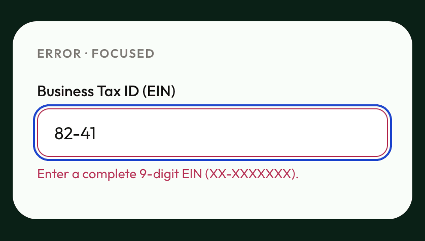
An invalid business tax ID still needs to look invalid when someone reaches the field with a keyboard. I defined the red error border and separate blue focus ring in Figma, implemented the state in Lookbook, and documented a rule with a clear fail condition. The generated screen preserved both signals. The test also revealed that the error-helper-text color had no named token; I added one to the pack and verified its use in the rerun.


Reflection
What I learned
Visual consistency can hide a product mistake.
The agent produced a plausible form while making decisions nobody had approved. The pack needed to say where its authority ended, as clearly as it described how a screen should look.
Evaluating the agent also audited the system.
Comparing generated work with Figma, Lookbook, and the pack exposed missing rules and drift between sources. Each finding needed a source update and a rerun.
Team use is the next test.
I proposed a path for missing steps: product and design decide whether the step belongs, design defines its behavior, authorization copy receives appropriate compliance review, and the step enters the pack and tests. This is a proposal, not an adopted IOU process.
Overview
I turned loan-application design decisions into agent instructions and tests.
As IOU Financial’s sole product designer, I built the customer-facing system behind our loan application. I created the screens and states in Figma, then built the coded components in Lookbook, our component preview library. Some product decisions still depended on what I knew from designing the product. To make those decisions usable beyond me, I brought the tokens, components, and screen recipes into a markdown pack. A companion skill told the agent to read it first, build from the system, and ask when a request was not covered.
I was testing whether the system was legible or just documented. Documented means it exists on paper. Legible means someone, or something, else can build from it correctly and knows to stop when they can't. The test was how I found the difference.
The Failure
On an undefined lending step, the agent built a convincing screen and invented authorization copy.
I asked for an income-verification step, which did not exist in the pack. The agent generated fields, dollar amounts, and the line “By continuing you agree to IOU Direct's Terms of Service and Privacy Policy.” It disclosed its assumptions only after building. This was an internal test, not an applicant-facing screen, but the risk was concrete: the output looked plausible while making product and authorization decisions nobody had approved.
“By continuing you agree to IOU Direct's Terms of Service and Privacy Policy.”
The Test
37 of 38 assertions passed. The one failure was the agent’s decision to build a step the system had not defined.
I locked the scoring assertions before reviewing output and ran eight tasks, each in a fresh session. I scored the rendered screens and generated code rather than the agent’s account of its work. Seven tasks tested documented screens and rules; the eighth tested whether it would stop at a missing product step.
All 12 original design-decision rules held on their scored exposures. The review also found four documentation gaps: desktop layout dimensions, a radio indicator color, an error-helper token, and rejection-screen positioning. The failed assertion was different. The agent had followed the visual system while inventing what the product should contain.
The test checked whether the agent knew when to stop, not just whether it could produce UI.
What Finally Worked
Stronger instructions still let the agent invent. Defining which product steps existed made it stop.
I first strengthened the skill’s instruction to ask before inventing. Then I ran the income-verification request again. The three outputs below show why that wording change failed and what finally closed the gap.
The agent built the undefined step, including fields, amounts, and authorization copy.
Rule in Practice
The same test showed that a specific design decision could travel from the product into generated code.
An invalid business tax ID still needs to look invalid when someone reaches the field with a keyboard. I defined the red error border and separate blue focus ring in Figma, implemented the state in Lookbook, and documented a rule with a clear fail condition. The generated screen preserved both signals. The test also revealed that the error-helper-text color had no named token; I added one to the pack and verified its use in the rerun.
Reflection
What I learned
Visual consistency can hide a product mistake.
The agent produced a plausible form while making decisions nobody had approved. The pack needed to say where its authority ended, as clearly as it described how a screen should look.
Evaluating the agent also audited the system.
Comparing generated work with Figma, Lookbook, and the pack exposed missing rules and drift between sources. Each finding needed a source update and a rerun.
Team use is the next test.
I proposed a path for missing steps: product and design decide whether the step belongs, design defines its behavior, authorization copy receives appropriate compliance review, and the step enters the pack and tests. This is a proposal, not an adopted IOU process.
Desktop-first · How Zing ended

mobile-first · How IOU ends


You’re Ready to Submit!
Your application is complete and ready for final review.
PRE-QUALIFICATION AMOUNT
$100,000
Estimated based on your business revenue.
Final offer may vary after bank verification
Business Name:
ABC Company LLC
Loan Purpose:
Equipment Purchase
Identity verified
Credit check completed
Bank account connected
I certify that the information provided in this application is true and accurate, and I consent to electronically sign and submit this application.
I agree to receive marketing communications, product updates, and special offers from IOU Financial.
You can unsubscribe anytime
Previous
Submit Application
Your information is protected with bank-level encryption
Final Step
100%

Desktop-first · How Zing ended
mobile-first · How IOU ends


You’re Ready to Submit!
Your application is complete and ready for final review.
PRE-QUALIFICATION AMOUNT
$100,000
Estimated based on your business revenue.
Final offer may vary after bank verification
Business Name:
ABC Company LLC
Loan Purpose:
Equipment Purchase
Identity verified
Credit check completed
Bank account connected
I certify that the information provided in this application is true and accurate, and I consent to electronically sign and submit this application.
I agree to receive marketing communications, product updates, and special offers from IOU Financial.
You can unsubscribe anytime
Previous
Submit Application
Your information is protected with bank-level encryption
Final Step
100%

COLOR
Emerald
emerald/700
#002115
emerald/600
#00543b
emerald/500
#117d4b
emerald/300
#88c59a
emerald/200
#cee7d5
emerald/100
#e9f3ea
emerald/50
#f9fdf9
Neutral
neutral/1000
#151413
neutral/800
#3f3d3a
neutral/700
#7d7a74
neutral/500
#d1ccc2
neutral/300
#e3e0da
neutral/100
#f6f5f3
neutral/000
#ffffff
Accent & feedback
green/500
#2bc947
feedback/error
#c82659
feedback/warning
#f45703
feedback/info
#124bd5
TYPOGRAPHY — OUTFIT
Title
32 / Medium / 36 line-height · emerald/700
Get started with your application
Subtext
17 / Regular / 24 line-height · neutral/1000
A few quick questions to see how much you qualify for.
SNIPPET OF COMPONENTS
Input fields — mobile
Default
Label
Enter your details
Focus
Label
Text Input
Error
Label
Text Input
Please enter a valid value
Password
Label
Create a password
Disabled
Label
Enter your details
Buttons — mobile
Contained · Emerald
Button
Contained · Green
Button
Outlined · Neutral
Button
Outlined · Emerald
Button
Outlined · Green
Button
Outlined · Pink
Button
SNIPPET OF DOCUMENTATION - BUTTONS
Mobile vs Desktop
Same button. On mobile it fills the screen width; on desktop it fills its (wider) container. Set an instance to Fill to get full-width — the button stretches to its parent.
Mobile
Continue
Desktop
Continue
Usage
• Contained for the primary action; Outlined for secondary. • Green = a distinct high-emphasis action (Submit). • Pink/error only for destructive. • Neutral is the quiet/tertiary choice. • Disabled drops the whole button to 40% opacity. • One button per view carries the primary emphasis.
In context
Button color is chosen by the surface it sits on. Emerald (#117D4B) is the primary action on light surfaces — cards, white backgrounds. Bright green (#2BC947) is used on the dark emerald page (#002115), where it pops. Green is never used as the primary on white.
Light surface (#F9FDF9) → Emerald
Continue
Dark card (#002115) → Green
Submit Application
COLOR
Emerald
emerald/700
#002115
emerald/600
#00543b
emerald/500
#117d4b
emerald/300
#88c59a
emerald/200
#cee7d5
emerald/100
#e9f3ea
emerald/50
#f9fdf9
Neutral
neutral/1000
#151413
neutral/800
#3f3d3a
neutral/700
#7d7a74
neutral/500
#d1ccc2
neutral/300
#e3e0da
neutral/100
#f6f5f3
neutral/000
#ffffff
Accent & feedback
green/500
#2bc947
feedback/error
#c82659
feedback/warning
#f45703
feedback/info
#124bd5
TYPOGRAPHY — OUTFIT
Title
32 / Medium / 36 line-height · emerald/700
Get started with your application
Subtext
17 / Regular / 24 line-height · neutral/1000
A few quick questions to see how much you qualify for.
SNIPPET OF COMPONENTS
Input fields — mobile
Default
Label
Enter your details
Focus
Label
Text Input
Error
Label
Text Input
Please enter a valid value
Password
Label
Create a password
Disabled
Label
Enter your details
Buttons — mobile
Contained · Emerald
Button
Contained · Green
Button
Outlined · Neutral
Button
Outlined · Emerald
Button
Outlined · Green
Button
Outlined · Pink
Button
SNIPPET OF DOCUMENTATION - BUTTONS
Mobile vs Desktop
Same button. On mobile it fills the screen width; on desktop it fills its (wider) container. Set an instance to Fill to get full-width — the button stretches to its parent.
Mobile
Continue
Desktop
Continue
Usage
• Contained for the primary action; Outlined for secondary. • Green = a distinct high-emphasis action (Submit). • Pink/error only for destructive. • Neutral is the quiet/tertiary choice. • Disabled drops the whole button to 40% opacity. • One button per view carries the primary emphasis.
In context
Button color is chosen by the surface it sits on. Emerald (#117D4B) is the primary action on light surfaces — cards, white backgrounds. Bright green (#2BC947) is used on the dark emerald page (#002115), where it pops. Green is never used as the primary on white.
Light surface (#F9FDF9) → Emerald
Continue
Dark card (#002115) → Green
Submit Application