ADID's Wayfinding System -
A More Accessible, Connected Atlanta
ADID Atlanta is the city's official destination and information organization, responsible for how millions of visitors and residents navigate the city — from transit hubs to event venues to accessibility resources. With the 2026 FIFA World Cup approaching, ADID needed to rethink how people find information in physical space. As UX Design Lead, I drove the project from research through delivery, running 105 surveys and stakeholder interviews across city officials, safety teams, and accessibility advocates to define what the system actually needed to solve. From there, I led my team through 50+ design iterations and 3 rounds of Maze usability testing to deliver three core products: a digital kiosk interface serving events, accessibility, and transit flows, a redesigned physical information desk built for staff efficiency and visitor approachability, and a design system I built from scratch to ensure consistency across digital and physical touchpoints and a clean developer handoff.
Role: UX Design Lead
Contribution: User research, Information architecture,
Interaction design, Visual design, Design systems, Usability testing, Dev-handoff
Home & Accessibility
Quick access to key destinations, live updates, and events. Built-in accessibility options like font sizing and wheelchair mode support inclusive use.
What Shipped
Three core flows — events, accessibility, and transit — designed for speed and clarity.
Transit & Map
Built for speed and clarity, this screen simplifies city navigation with live maps, key transit icons, and intuitive directions.
Icons
Modals
Built for Handoff
One system to keep the kiosk and information desk consistent at scale.
Components
Templates

Mid-fi
Moved to Figma. Locked in structure and touch targets.

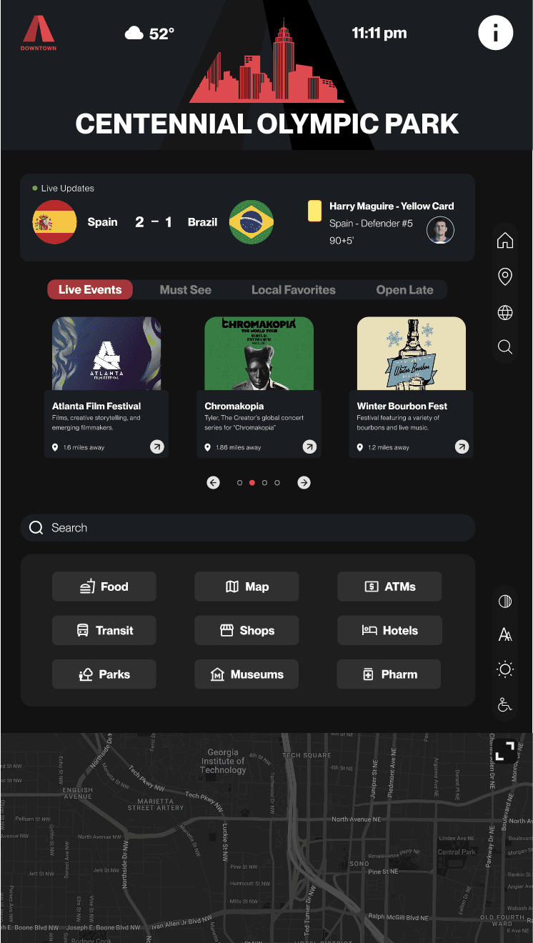
High-fi Iteration 1
Applied ADID's brand with accessibility built in.
High-fi Iteration 2
Dark mode and refined hierarchy for better clarity.
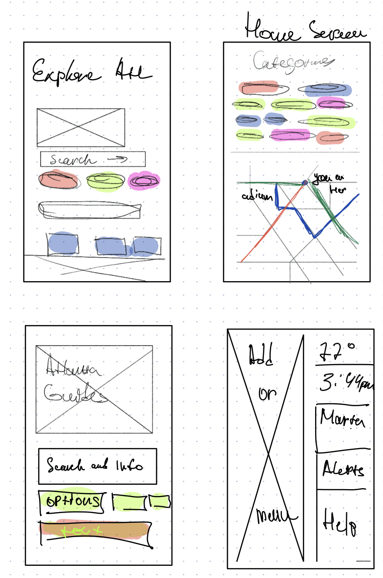
Low-fi
Started on paper to explore how visitors move through the kiosk.
How We Got Here
50+ iterations from sketch to shipped
User 1
User 2
User 3
User 1
User 2
User 3
User 1
User 2
User 3
User 1
User 2
User 3
Physical Testing
No screen yet, so we built a full-scale paper prototype.
7 users validated the layout before development.

Heatmap: Home Screen
84.6% found events via search

Heatmap: Selected Event Screen
20 of 26 found "Get Directions" without confusion
Heatmap: Transit Screen

Maze Testing · Iteration 3
26 users across 3 rounds. Each round refined navigation, icons, and layout.
Users found routes easily — refined icon hierarchy
Did It Work?
Paper prototype testing with 7 users. Then 3 rounds of Maze on our third iteration.
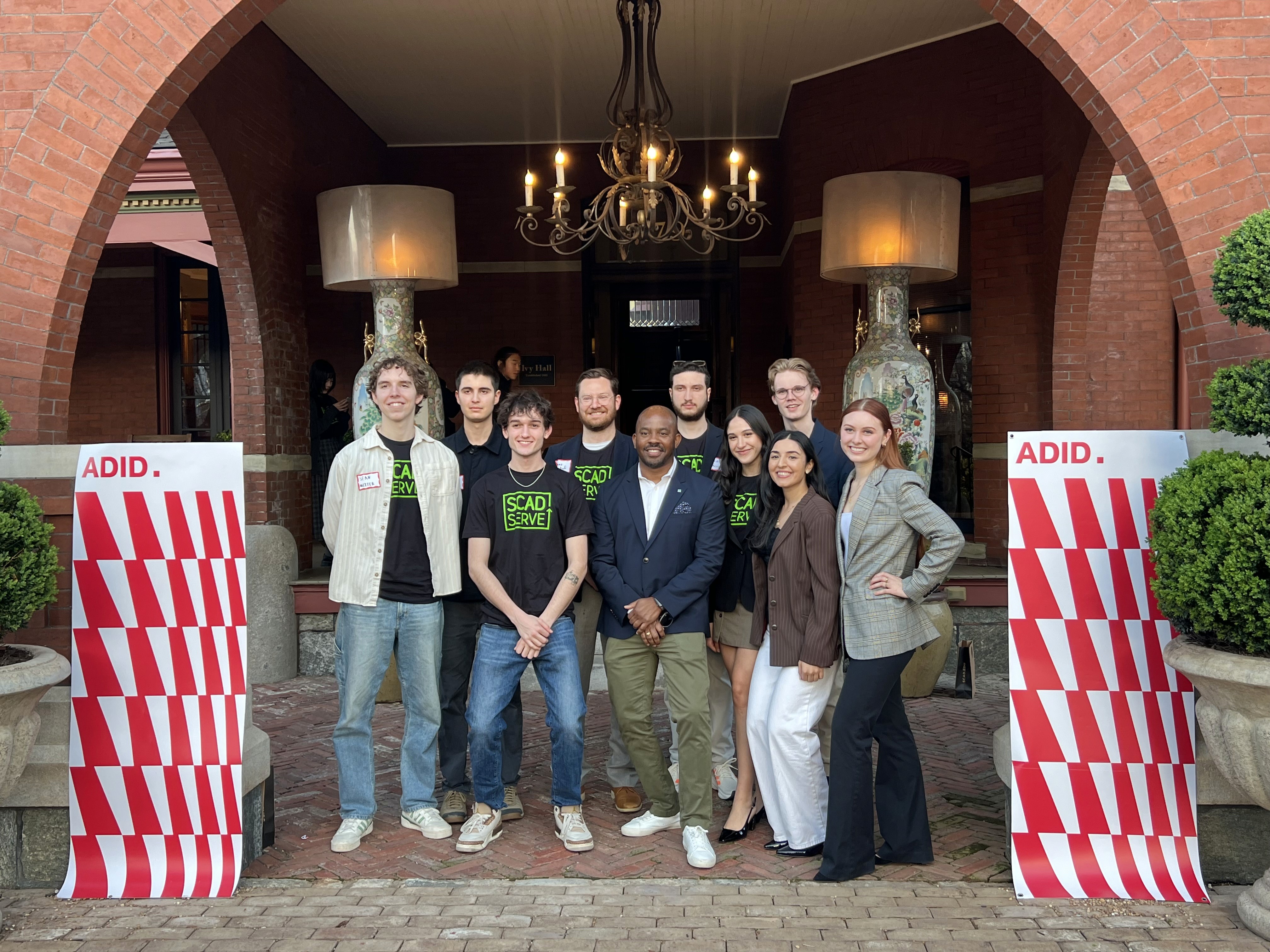


Delivered
Handed off to ADID — ready for the 2026 World Cup.

Beyond The Screen
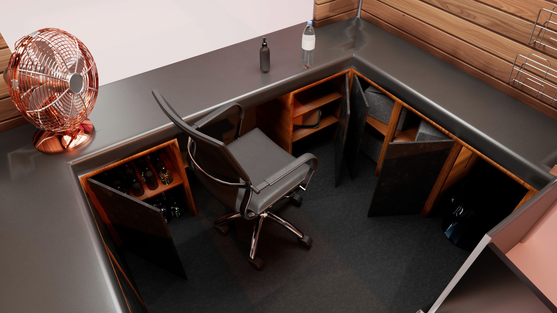
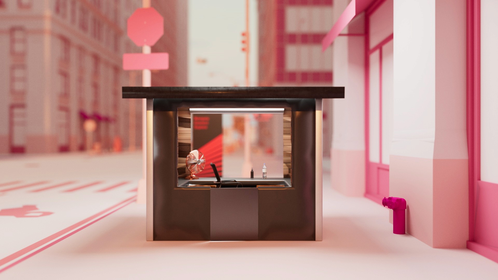
The information desk redesigned for visibility, accessibility, and staff efficiency.
Delivered
Handed off to ADID — ready for the 2026 World Cup.
Role: UX Design Lead
Contribution: User research, Information architecture, Interaction design, Visual design, Design systems, Usability testing, Dev-handoff
ADID's Wayfinding System -
A More Accessible, Connected Atlanta
Final Interface Deisgn
Information Booth
Solution Overview:
What Shipped
Three core flows — events, accessibility, and transit — designed for speed and clarity.
Final Interface Deisgn
Information Booth
Conducted research with 105+ survey respondents and stakeholder interviews
Created comprehensive design system with WCAG accessibility compliance
Executed Maze testing sessions across three rounds of iteration
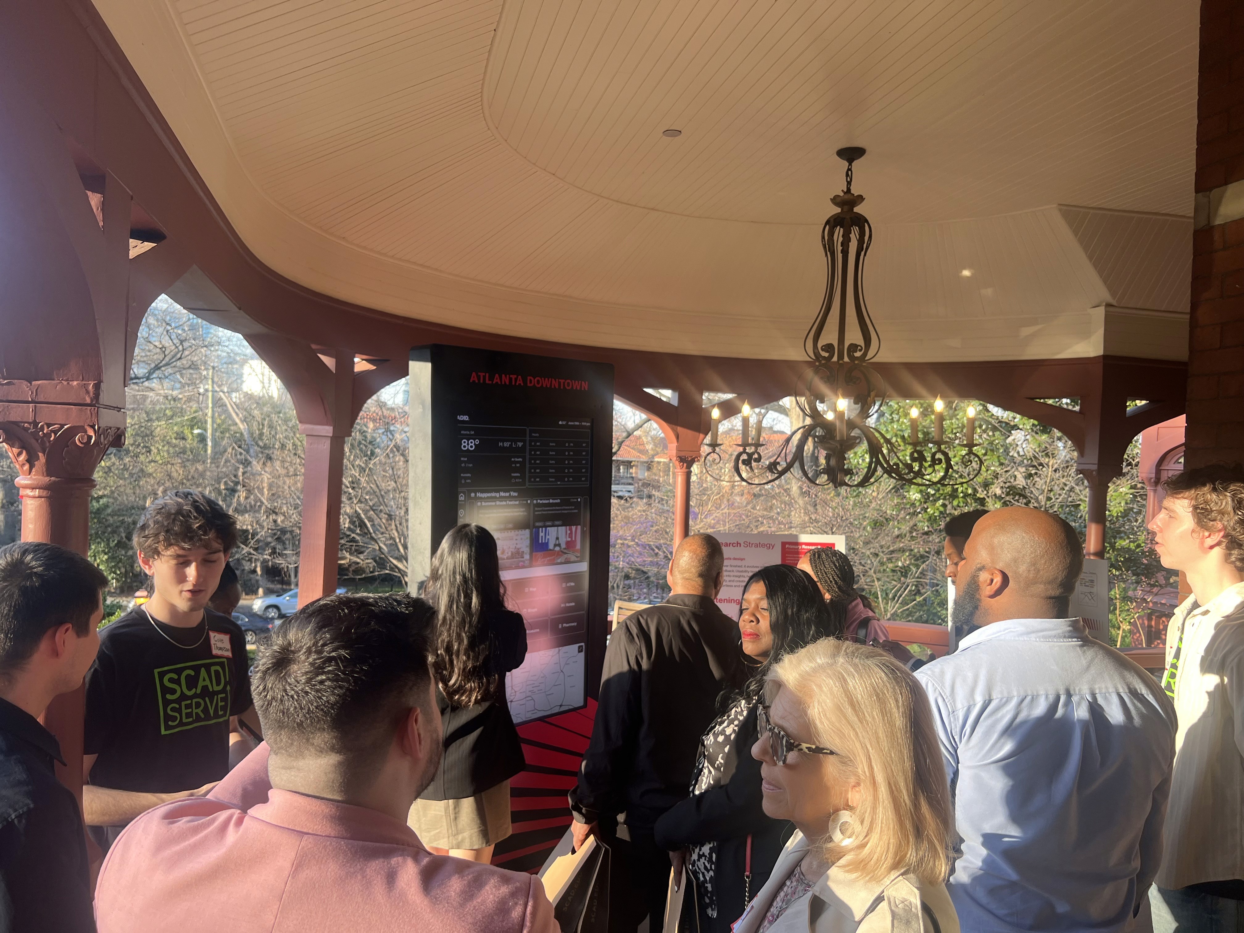
Physical Implementation
Our final presentation showcased the complete project scope and real-world impact of our digital kiosk and reimagined information desk.
Delivered
Handed off to ADID — ready for the 2026 World Cup.

See full case study with process on desktop!
Impact
Delivered a modern, accessible wayfinding experience that bridges physical and digital touchpoints for Atlanta's diverse community, with usability improvements validated through rigorous testing.